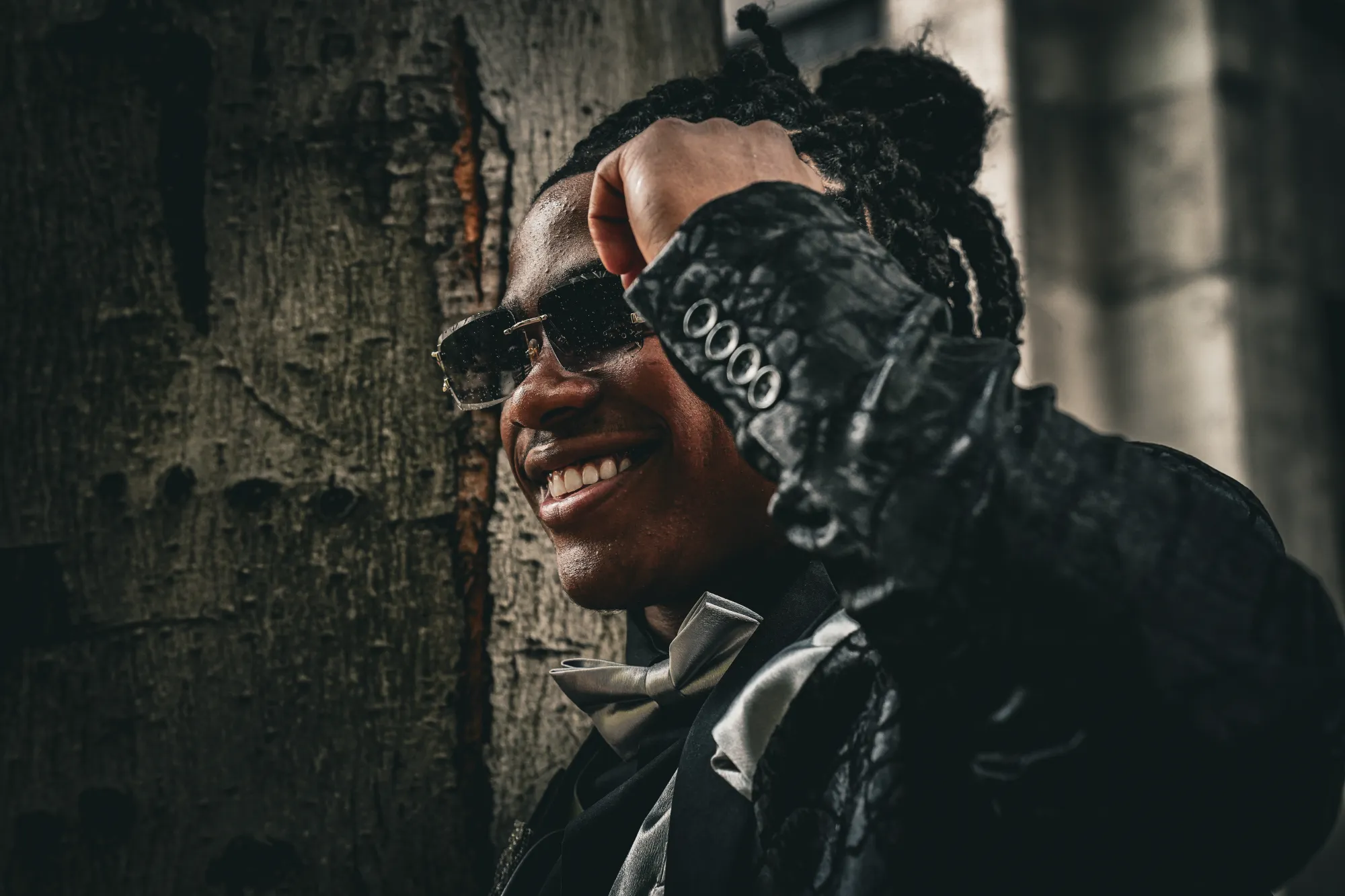
Bryan Haynes
Greater Seattle
Bryan Haynes
Photographer · Brand Designer
Photography
Enter the gallery →
Bryan Haynes
Design
View the work →
{{ c.index }} / {{ c.name }}
{{ h.img }}
{{ h.title }}
{{ h.tech }}
{{ h.label }}
"As each has received a gift, use it to serve one another."
1 Peter 4:10
Let's make something worth keeping.
bry.haynes08@gmail.com
{{ activeCollection.index }} — {{ activeCollection.name }}

{{ activeCollection.title }}

{{ activeCollection.blurb }}
{{ activeCollection.rhythm }}
{{ im.img }}
{{ im.title }}
{{ im.line }}
{{ im.label }}
Next collection
End of the collections
Bryan Haynes — Design

A young designer, learning by building real things.
Brands, campaigns, and the occasional tool — work I've been trusted with early, and tried to do carefully.
Selected work ↓
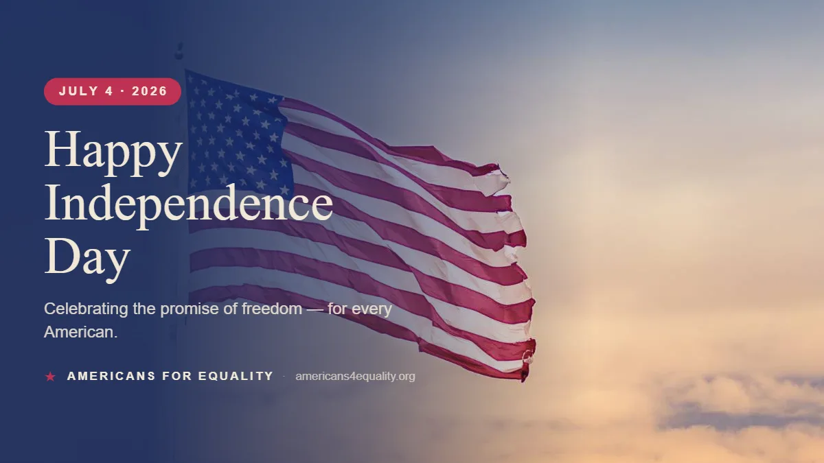
Engine output — Independence Day social banner
Brief
"July 4 social post — hopeful, flag, sunset."
Made with AI
A Field
Guide
Marketing with Purpose
Americans 4 Equality
10-page PDF · cover + spreads
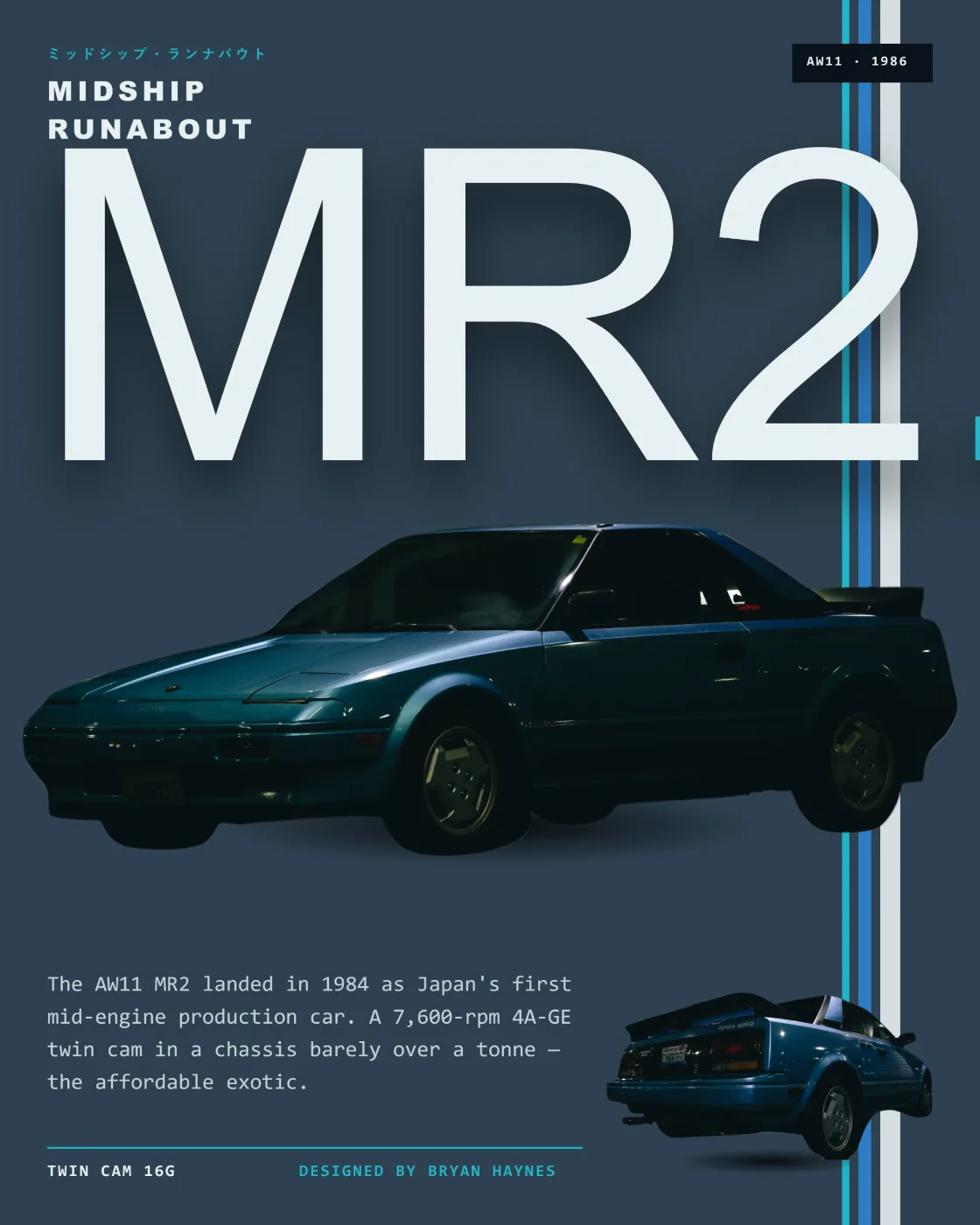
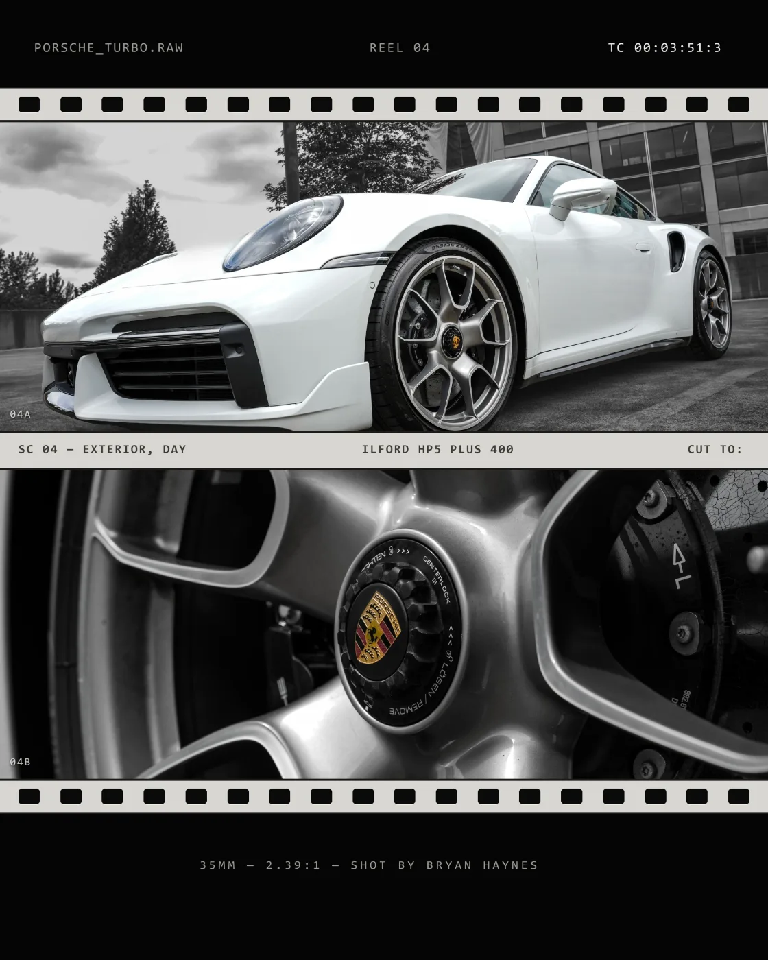
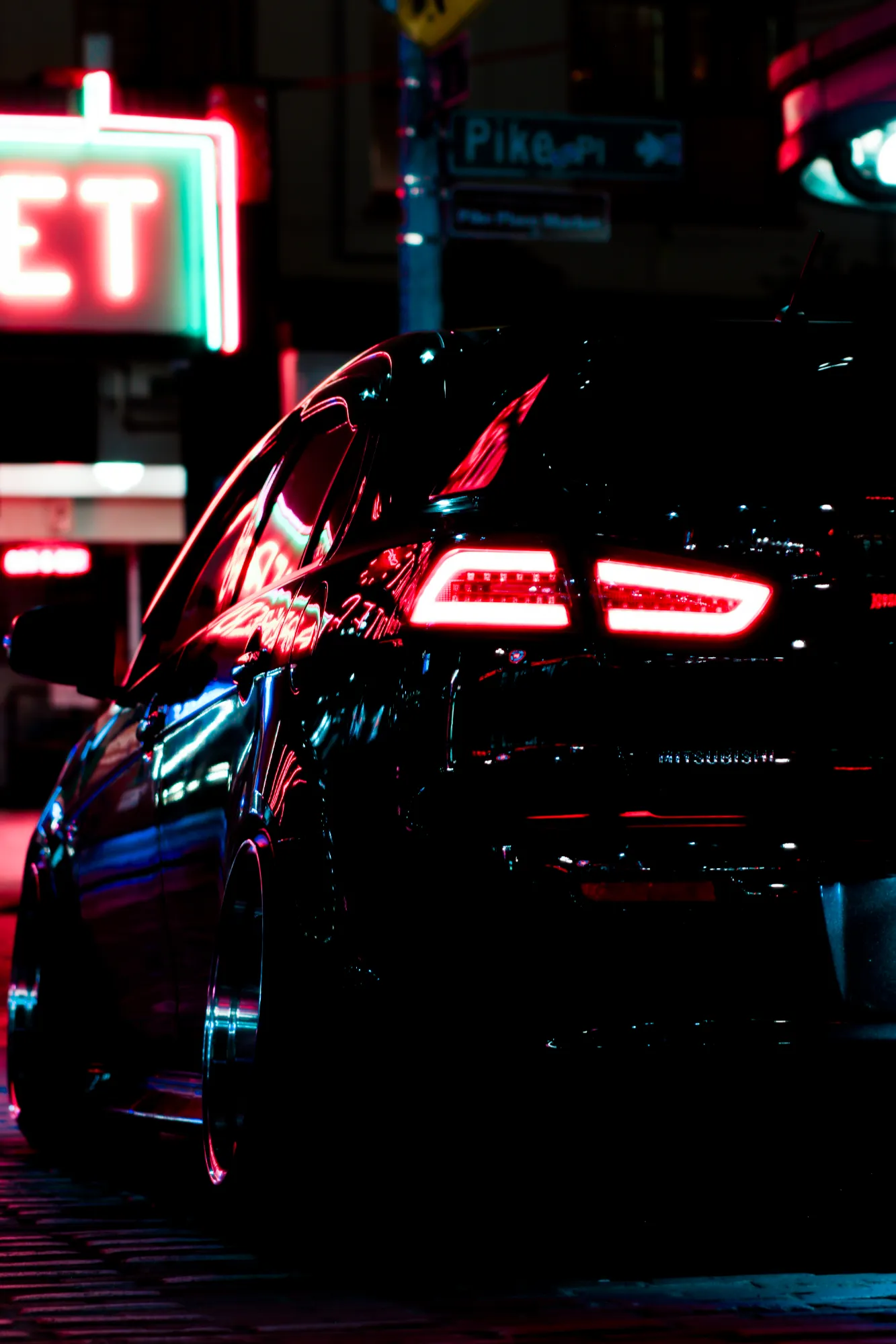
lancer. — spec-sheet poster, Mitsubishi Lancer at night Midship Runabout — retro brochure poster, Toyota MR2 AW11 Film Still — 35mm strip poster, Porsche 911 Turbo S
{{ f.shot }}
{{ f.role }}
{{ f.name }}
{{ f.sub }}
In progress
View case study →
Collaborated with — via A4E
{{ org }}
Photography — direct clients
{{ org }}
More work
{{ p.name }}
{{ p.name }}
{{ p.glabel }}
{{ p.tags }}
{{ moreOpenName }}
{{ moreOpenTags }}
{{ g.cap }}
Made with AI
Flagship 01 · Brand System

A4E Brand System & Field Guide

I helped give A4E a public identity — and wrote down what we learned so it wouldn't depend on me.
Brand identity System design Authorship
A Field Guide — Marketing with Purpose
A4E
A Field Guide
Marketing with Purpose
Americans 4 Equality
Inside the guide —
A4E
Identity
Aa
Type & voice
Color
Systems in use
The challenge
Real services, no recognizable name.

Before the system, A4E's public face was whatever the current interns could make: flyers in whatever fonts came to hand, colors that shifted from post to post, layouts rebuilt from nothing each time. Across years of material, the only consistent element was the logo itself.

The organization was selling real services with no recognizable name behind them. And because the work was intern-made, everything reset with every rotation — whatever visual habits one cohort built walked out the door with them.

JOIN US!!
community event · saturday
FREE
FOOD
sign up @ front desk!!
Volunteer with us…
Free Classes
~ enroll today ~
est. 2019
Three flyers, three identities — same month
01
Works as marketing
It has to sell — not just look considered.
02
Consistent high quality
Reproducible at the same standard by whoever makes the next piece.
03
True to the cause
It has to sell the mission to hearts, not just eyes.
The logo was fixed. Everything else was designed around it.
The approach
Many directions, three tests.

The system took about six months, built from scratch. Early on there were far more directions than survived — each one had to pass the same three tests before it stayed on the table.

One constraint was non-negotiable: the logo already existed and wasn't changing. So instead of designing an identity and fitting a mark into it, the identity was built around the logo — its geometry, weight, and temperature set the terms for everything else.

Color
Accessibility first, then beauty.

The palette started from a rule, not a mood board: nothing may depend on color alone. One of the organization's early instructors is color-blind — every design is checked so distinctions still read without hue, and contrast holds for low vision.

From there, a color study against the fixed logo. Navy carries authority and does most of the talking. Red is a rare accent, spent deliberately. Cream keeps long reading easy on the eyes.

a4e.org/brand/color
Color — 01
Brand palette · print + screen
Primary
Navy
HEX 1E3A5A
RGB 30 · 58 · 90
CMYK 67 · 36 · 0 · 65
Accent
Red
HEX B23A32
RGB 178 · 58 · 50
CMYK 0 · 67 · 72 · 30
Field
Cream
HEX F6EFE0
RGB 246 · 239 · 224
CMYK 0 · 3 · 9 · 4
Navy 65 — leadsCream 30 — fieldRed 5 — spent deliberately
Aa
Navy / Cream
9.7:1 · AAA ✓
Aa
Cream / Navy
9.7:1 · AAA ✓
Aa
Red / Cream
5.1:1 · AA ✓
Aa
Red / Navy
1.9:1 · ✗ never
Rule 01 — nothing depends on color alone · WCAG AA minimum: 4.5:1 body · 3:1 large text
a4e.org/brand/type
Type — 02
One family · open license
Public Sans
ABCDEFGHIJKLMNOPQRSTUVWXYZ abcdefghijklmnopqrstuvwxyz 0123456789
Aa
Regular 400
Aa
SemiBold 600
Aa
Bold 700
Aa
Italic — emphasis
Opportunity is not.
Display · Bold · 1.05
Bold and declarative.
Headline · Bold · 1.2
Steady and legible at every size.
Body · Regular · 1.55
Caption · labels · wayfinding
Caption · SemiBold · tracked
The floor — body never below 14px on screen, 10pt in print · available in every common font library
Type
Legible first, expressive second.

Type was chosen for legibility before character — expressive without theatrics, with strong bold and italic cuts so hierarchy never has to lean on color.

Just as deliberate: every family is available in every common font library. A rotating intern on any machine can reproduce the brand without hunting down a license.

Voice
The way A4E already spoke, written down.

The organization had a way of speaking before it had a voice guide — rough, but real. The guide codifies it: direct, declarative, specific, and deliberately apolitical. It flexes from middle-school plain to thesis-level precise without changing character.

The clearest rule is the honest one: everyone has an opportunity here — not the "everyone is accepted" charade.
a4e.org/brand/voice
Voice — 03
Six principles · from the field guide
Direct Declarative Specific Confidently inclusive Warm without softening Mission-forward
Use
"Our doors are open."
Avoid
"We strive to welcome all backgrounds."
Use
"Tuition-free. By design."
Avoid
"We strongly believe education is a human right."
We say
Tuition-free · Student · Cohort · Pathway
We don't
Underprivileged · At-risk · Beneficiary · Empower
The habit — read every draft aloud; if it sounds like every nonprofit, rewrite it
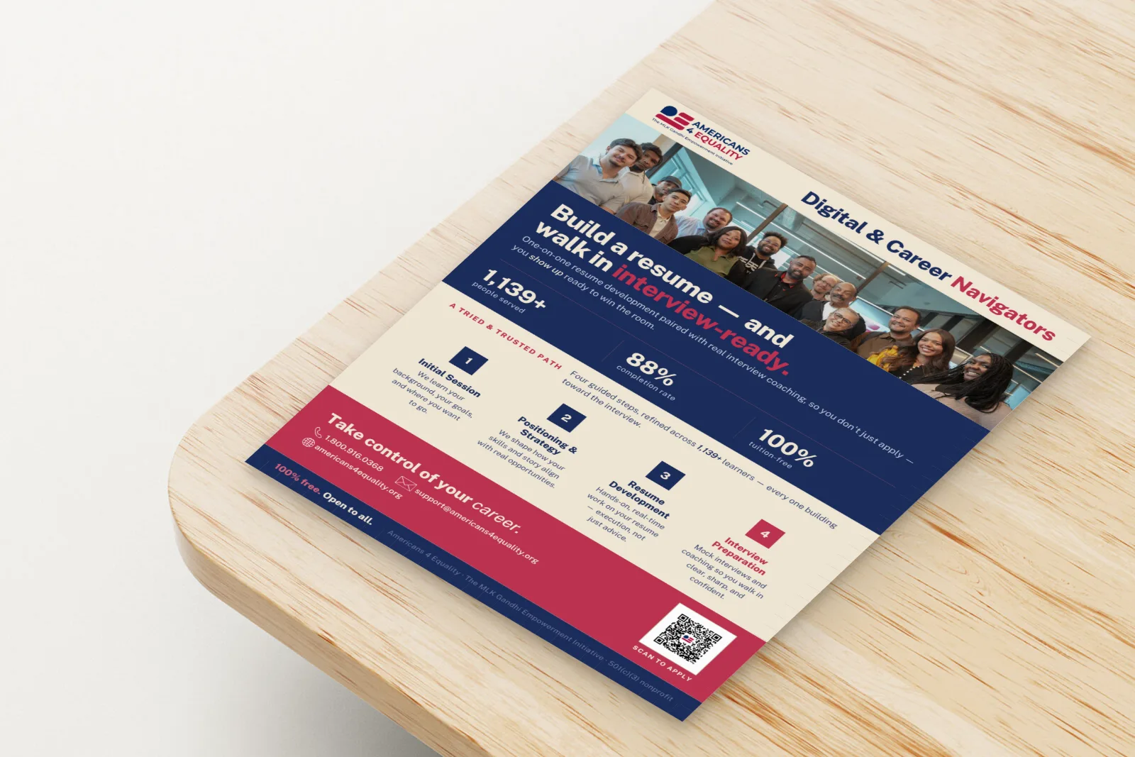
A4E Digital & Career Navigators flyer — the brand system applied in print, on a table
Program flyer · print
In use
Built under zero budget, holding everywhere.

The system was built under a zero-dollar marketing budget. Restraint isn't a style choice here — it's the operating reality. Every element had to work in free tools, on donated time.

And it holds: across every channel and every pair of hands — social, print, decks, banners — made by whoever is in the seat that month.

A4E
A Field
Guide
Marketing with Purpose
Public release · v1
The field guide
Written down, and given away.

The whole system lives in a public field guide — A Field Guide: Marketing with Purpose. A4E's mission is to teach — and most public brand guides are three to five years stale by the time they're shared. Publishing current craft is mission-true, and it's an edge.

↓ Read the field guide (PDF)
Since the system shipped · YTD
+430%
LinkedIn impressions
+50% followers
+275%
Meta views
+25% followers
125+
Branded assets shipped
Print · social · web
Flagship 02 · Built Tool

A4E Content Engine

After helping write the brand's rules, I tried building a tool to help us keep them.
Tool design AI Workflow
Content Engine — Live
Brief
Goal
Mark Independence Day
Audience
Full community, all channels
Channel
Social banner · 1200×675
Rough note
"happy july 4th post — freedom for every american??"
Generated graphic: Happy Independence Day banner for Americans for Equality — a flag against a sunset sky
On-brand ✓
Made with AI
Interface stylized — inputs, outputs & process shape only
What it is
The field guide set the standard. A small team can't hold it at volume — by hand.

The engine takes a rough brief and produces finished, platform-ready visual designs — social, flyers, banners, decks — with SEO and accessibility built in, not bolted on. It works step by step, like a collaborator you can intercede with at any point. Not a black box.
Built with AI design tooling (model-agnostic) · Markdown + .ase machine-readable brand system · chatbot interface
How it works
01
Brief in
A goal, an audience, a rough note — whatever exists.
02
Build together
Step by step — you can intercede at any point.
off-system ↗
03
Stays on-brand
Enforces the guide; anything off-system escalates to a human.
04
Finished output
Platform-ready designs — not drafts to redo.
Output — real, public work
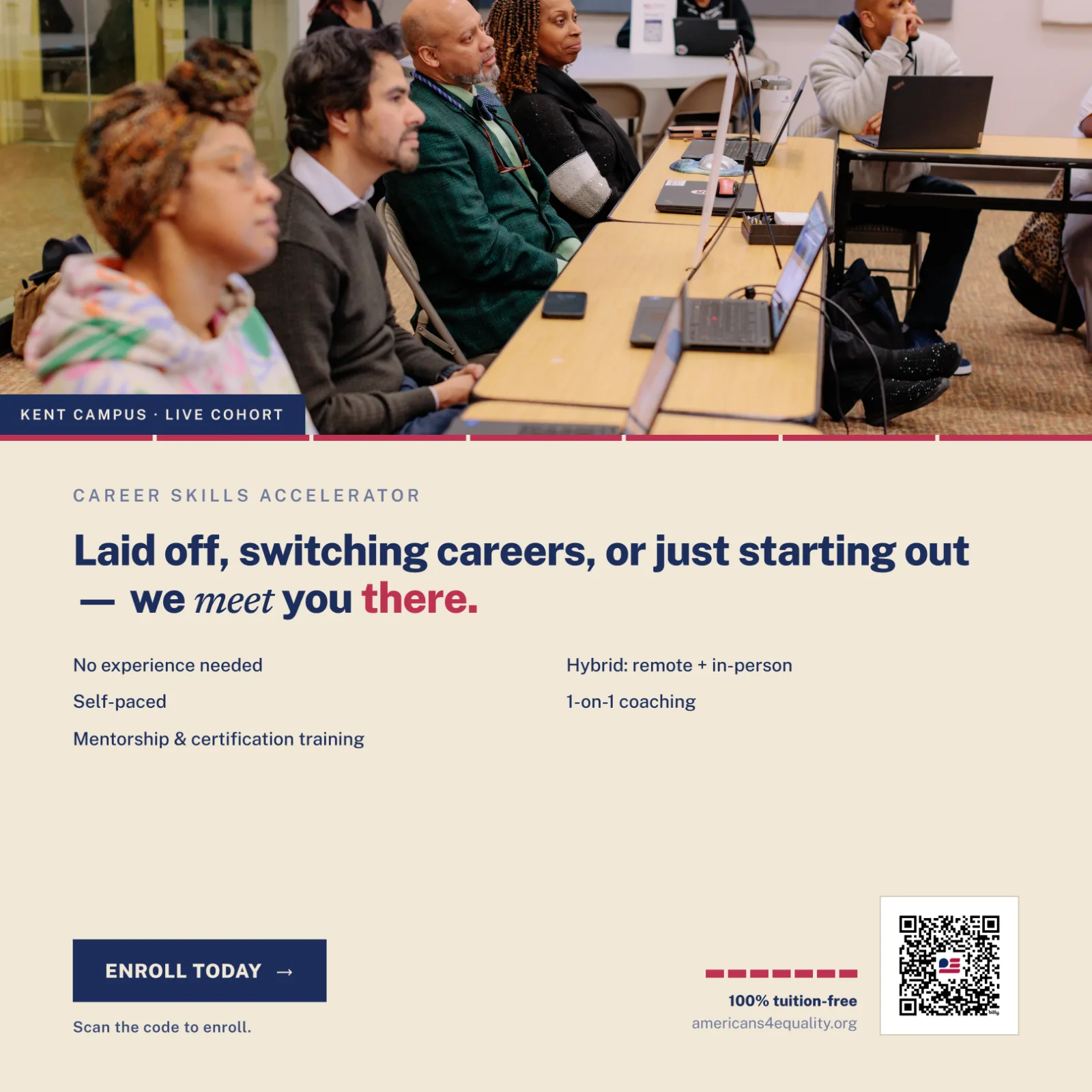
Career Skills Accelerator social post — 'Laid off, switching careers, or just starting out — we meet you there.'
Social · 1:1
Made with AI
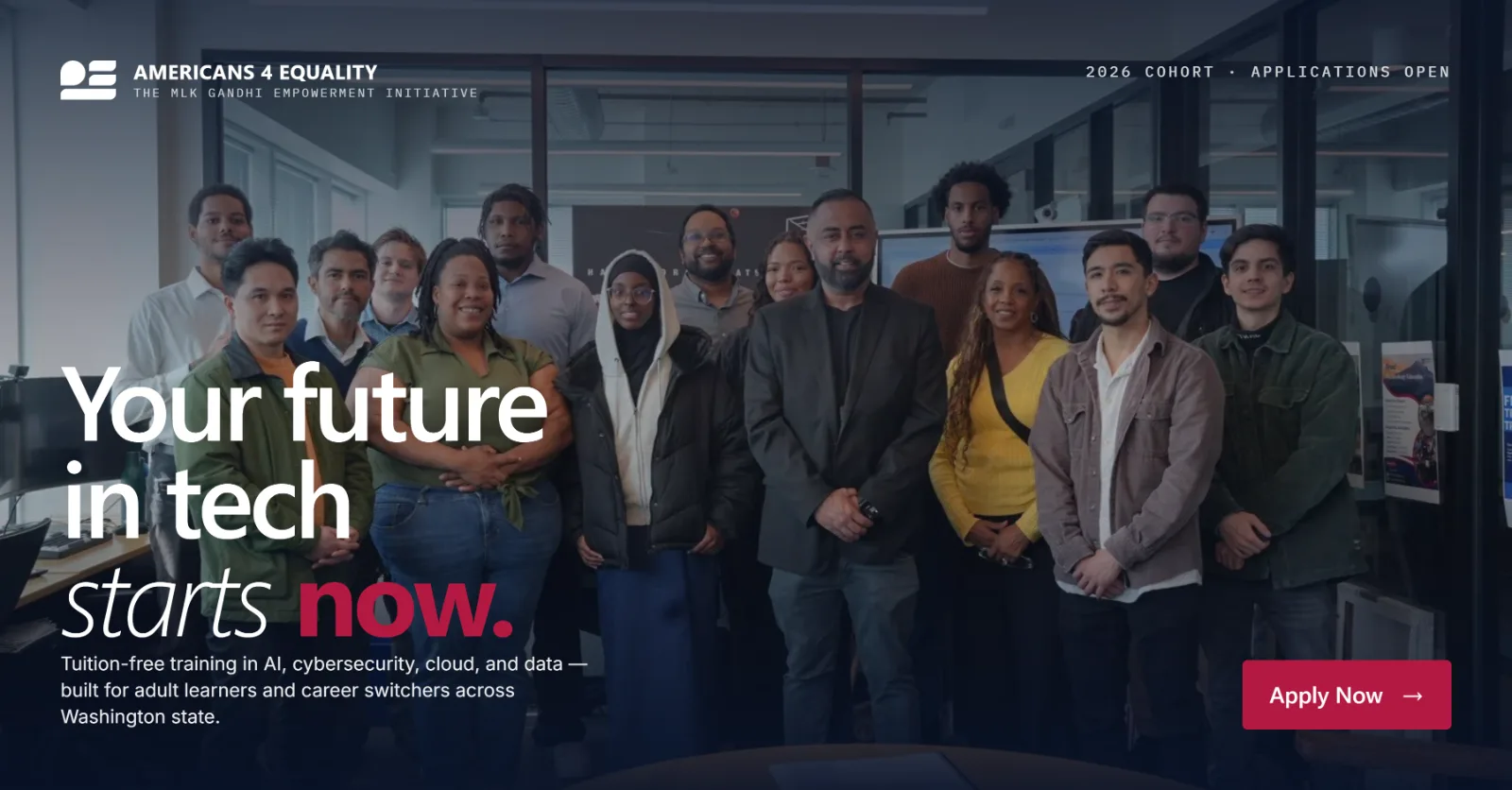
'Your future in tech starts now' — LinkedIn and Facebook banner, engine output
Social · LinkedIn / Facebook · 1200×627
Made with AI
Stays on-brand
The rules we wrote, kept by the tool.

Every output is checked against the field guide — voice, contrast, color. Anything the system can't verify doesn't ship quietly; it gets flagged and escalated for a human call.

Guide check · 4 items
Voice — direct, declarative, matches the guide
Contrast — holds for low vision, no color-only cues
Color — navy leads, red spent deliberately
!
Claim needs a source — escalated
20–30 hrs
cut from production each week
$3,600+
saved per year
3–5/week
publishing cadence — up from 8/month
15
reusable templates power it — of 20+ built
Flagship 03 · Poster Series

Automotive Poster Series

Cars from my own photo archive — each one given the poster language its photograph asked for.
Photography Art direction Print design
lancer. — No. 001. Spec-sheet poster: a Mitsubishi Lancer at night under neon, framed by document chrome
No. 001 · Mitsubishi LancerArchival spec sheet
Midship Runabout — No. 002. Retro brochure poster: a first-gen Toyota MR2 with tri-stripe and katakana
No. 002 · Toyota MR2 · AW11Period sales brochure
Film Still — No. 003. 35mm strip poster: a white Porsche 911 Turbo S in monochrome, crest in color
No. 003 · Porsche 911 Turbo S35mm film still
Series ongoing · click any poster to view large
From the archive
The photographs live on the other side of this site.
Bryan Haynes
About

I came to photography from the other side of the lens — modeling for a friend in high school, until the day I stepped behind the camera and something clicked that hasn't stopped since. For years it was just me and a simple camera in local gardens and neighborhoods, chasing whatever I found beautiful and learning what light could do. That slow start taught me what I still believe: the smallest details hold the most, and a photograph, done right, is a window to a memory you get to keep.

In recent years I've sharpened that eye through Americans 4 Equality, a nonprofit I joined as a marketing intern in 2025 — learning from some of the best in the industry, shooting events with partners like Microsoft and Salesforce, and building the brand from a single logo. I now lead that work as Head of Marketing, with a four-person intern team behind it. Alongside that, I photograph directly for local political leaders and public figures. Whether it's floral, automotive, landscape, or commissioned portraits and events, I'm after the same thing — to help you hold onto moments in the form of photographs you'll cherish, long after the moment has passed.

Based in
Greater Seattle
Available for
Travel & commissions
Crafts
Photography · Design
Commissioned
75+ shoots since 2018
Collaborated with — via A4E
{{ org }}
Photography — direct clients
{{ org }}
Contact

Let's work together.

{{ contactLead }}

bry.haynes08@gmail.com
{{ lbImg }}
{{ lbTitle }}
{{ lbCounter }}